App Design & Development
- Information Architecture (IA)
- User Experience Design (UX)
- User Interface Design (UI)
- Front-End Development
Mission Planning
Roket carefully evaluated the industry, deconstructing it's users, product offerings, and use cases during our collaborative Mission Planning process.
Personas
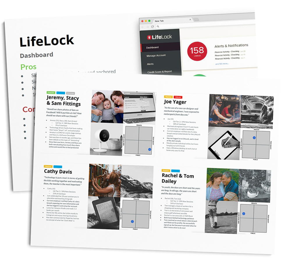
We defined a set of detailed user personas. The majority of users had just experienced a breach, leaving their data compromised. Dual axis maps let us compare our user’s level of proficiency with technology and their privacy concerns to better understand how they will approach and respond to the SaaS product.
Competitive Analysis
Identity theft protection is a competitive area, especially in recent years. Our team carefully assessed the competition, plotting their strengths, weaknesses, and depth of features. We then created a report containing our strategy for feature implementation, visual design, and overall user experience.
User Experience
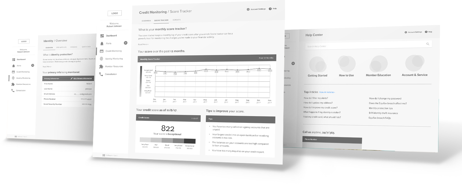
With guidance from our research, we created detailed interactive wireframes, information architecture, and in-depth user testing in order to discover helpful insights that went a long way in creating the best possible experience for our users.
Information Architecture
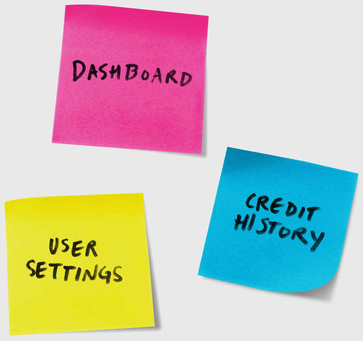
We were tasked with combining several existing applications and a new set of features into one product. We used sticky notes to diagram the relationship between features, pages, content, and user actions in order to define the structure of the product.
User Testing
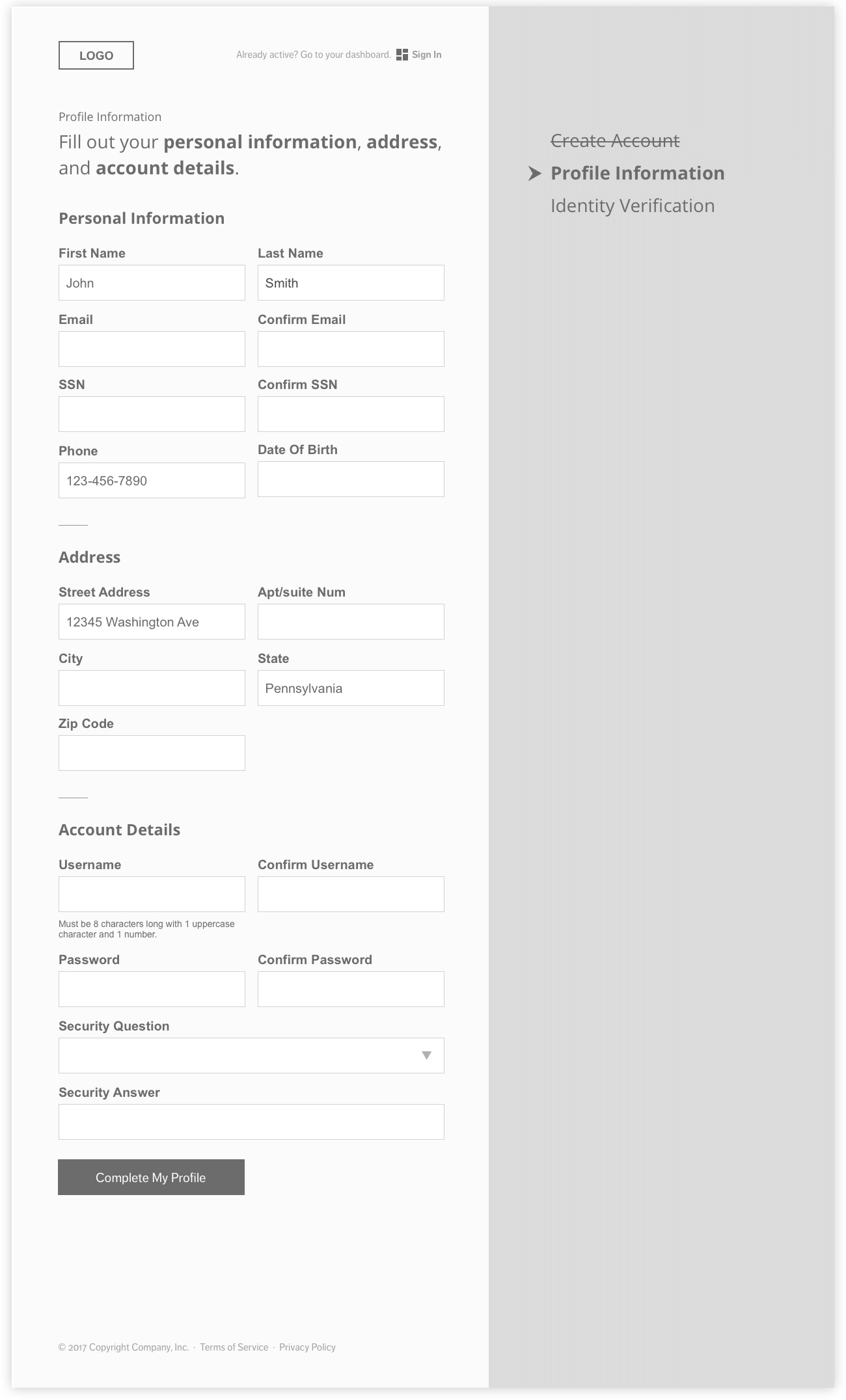
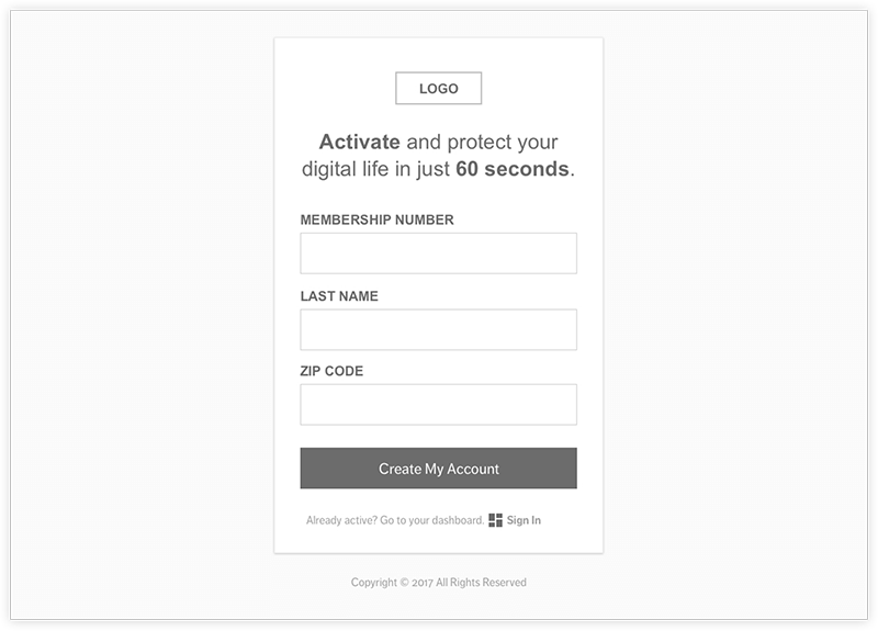
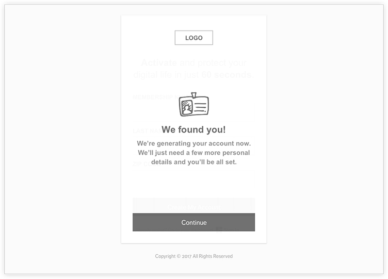
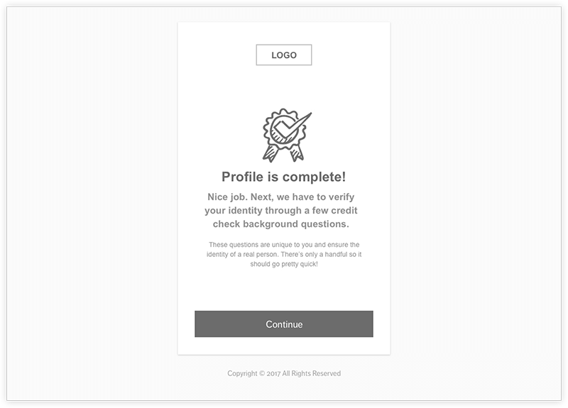
Roket identified “high impact zones” in the UI to prioritize our user testing exercise. We used the application Invision to create clickable prototypes to compare A/B scenarios for components including registration and user dashboards. We tested our theories through a series of coffee shop testing sessions and in-depth feedback from usertesting.com. The results were incorporated into the wireframes before we moved focus to high-fidelity design.
Option A
Option B
Application UI Design
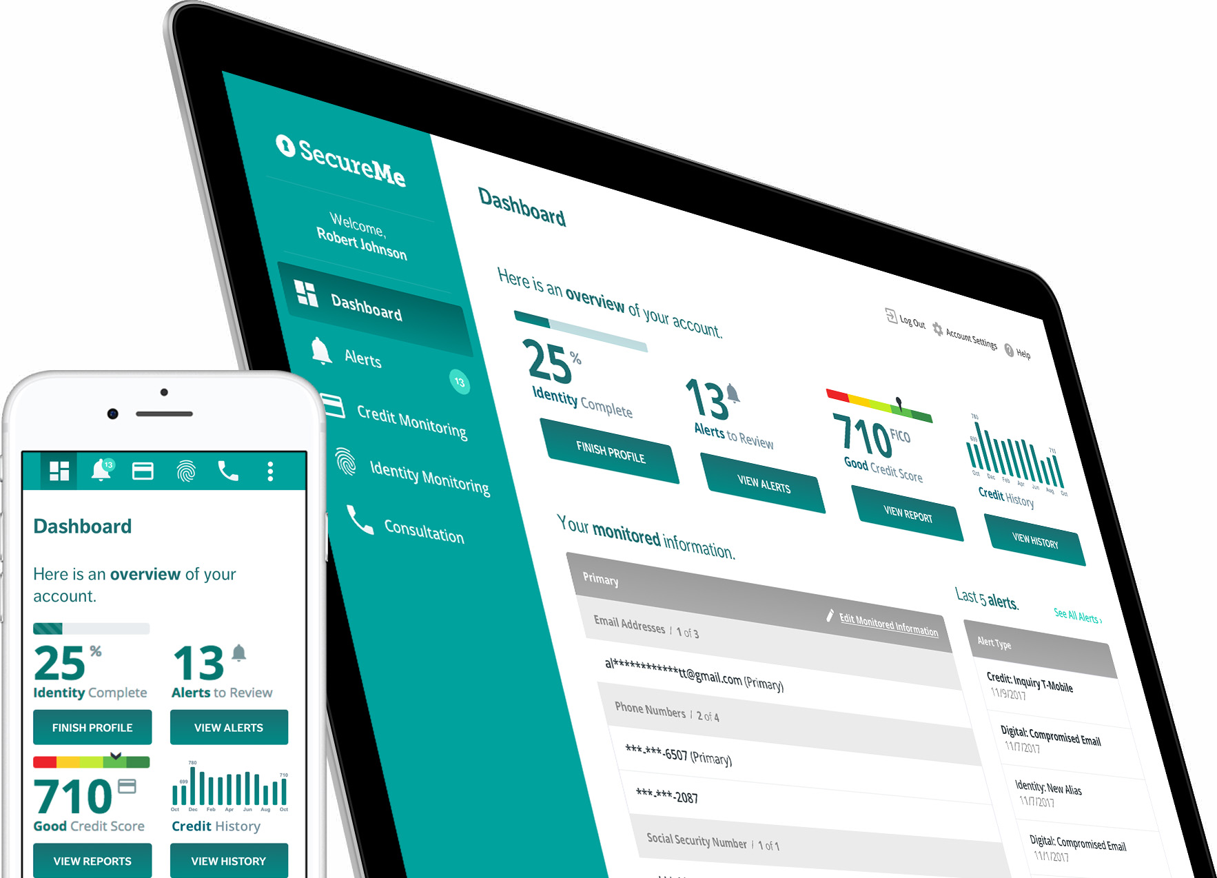
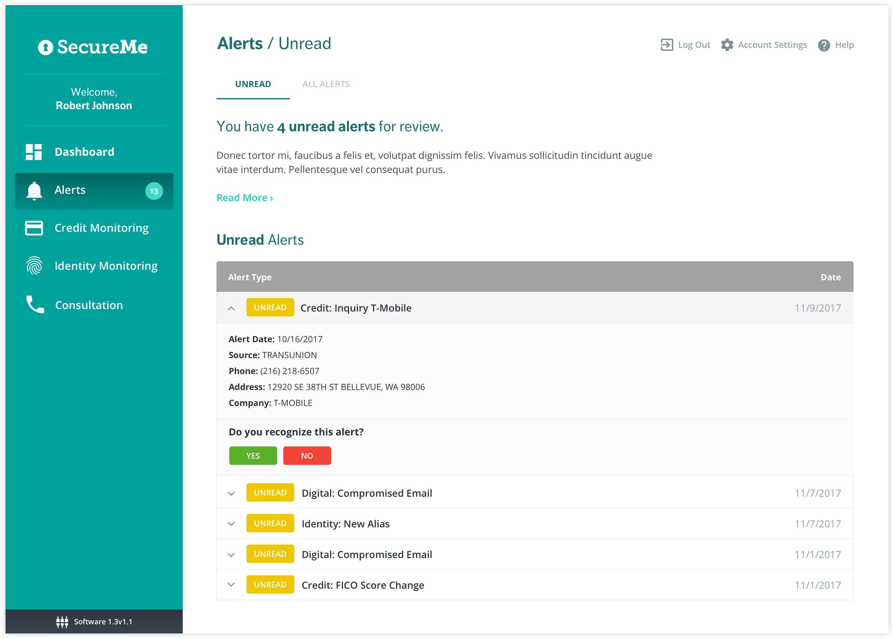
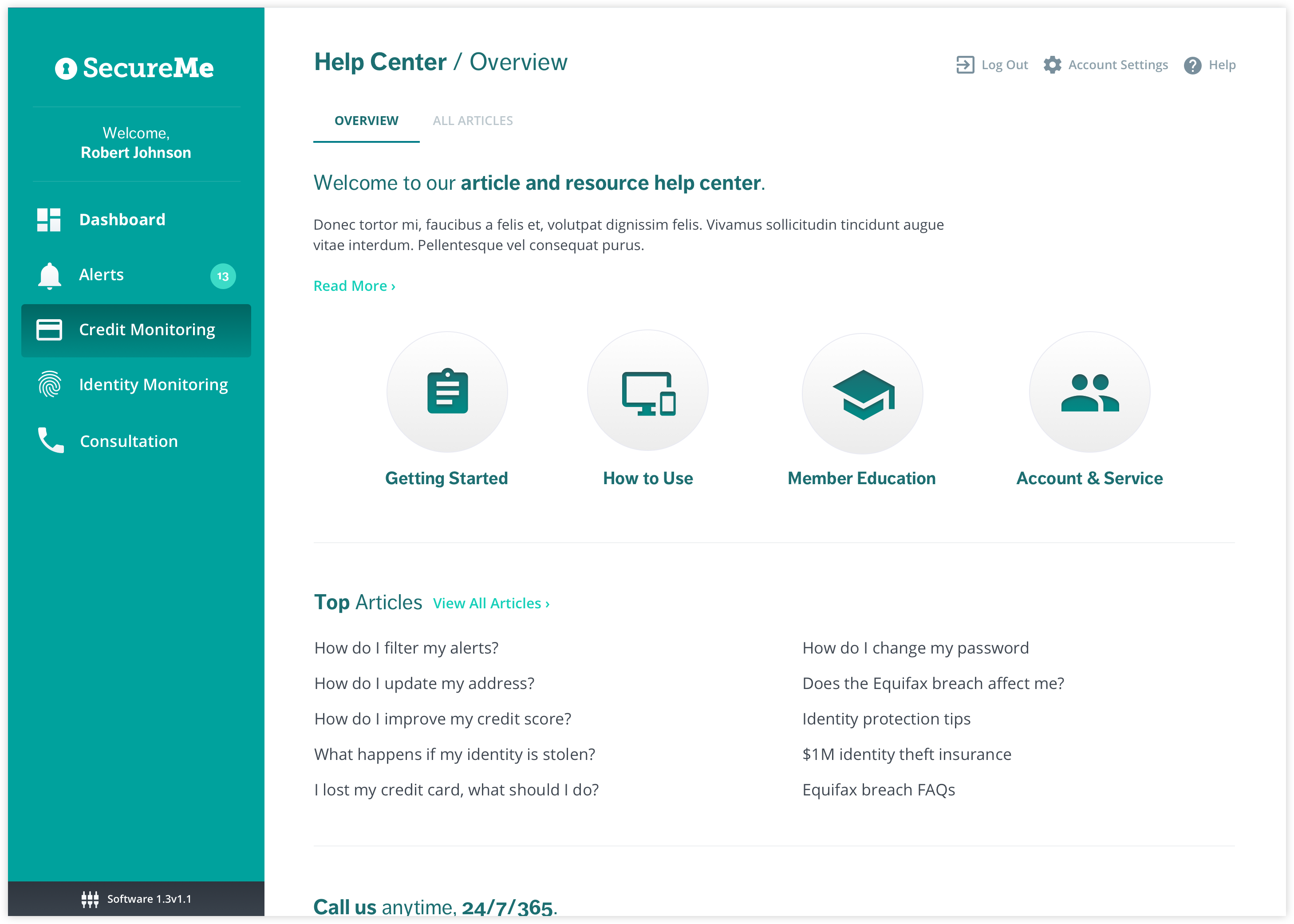
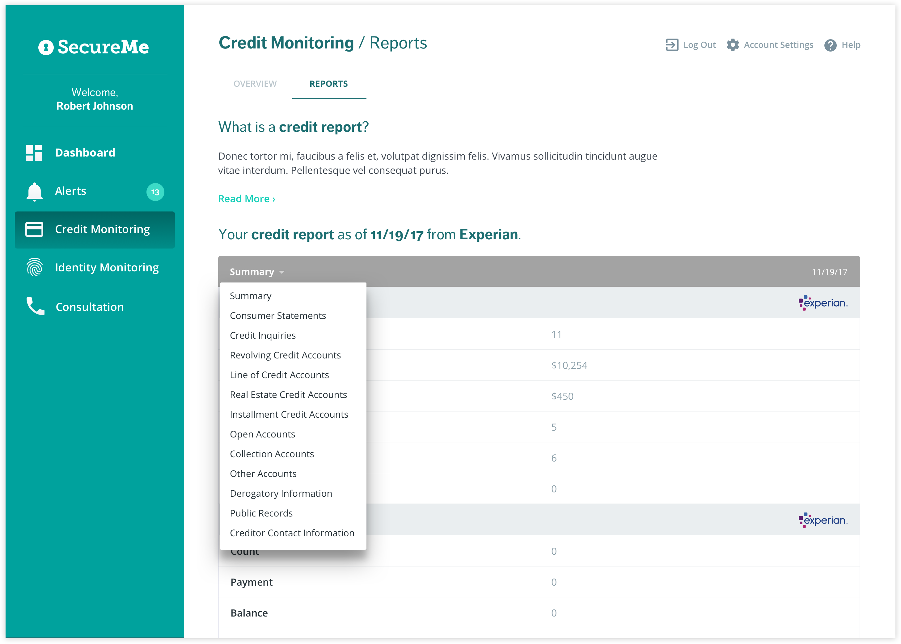
We created a simple, familiar visual style for the product's interface that allows for a variety of user types—regardless of experience—to easily accomplish their goals. This effort, and the way in which we applied style to the components, also prepared the UI for white labeling.
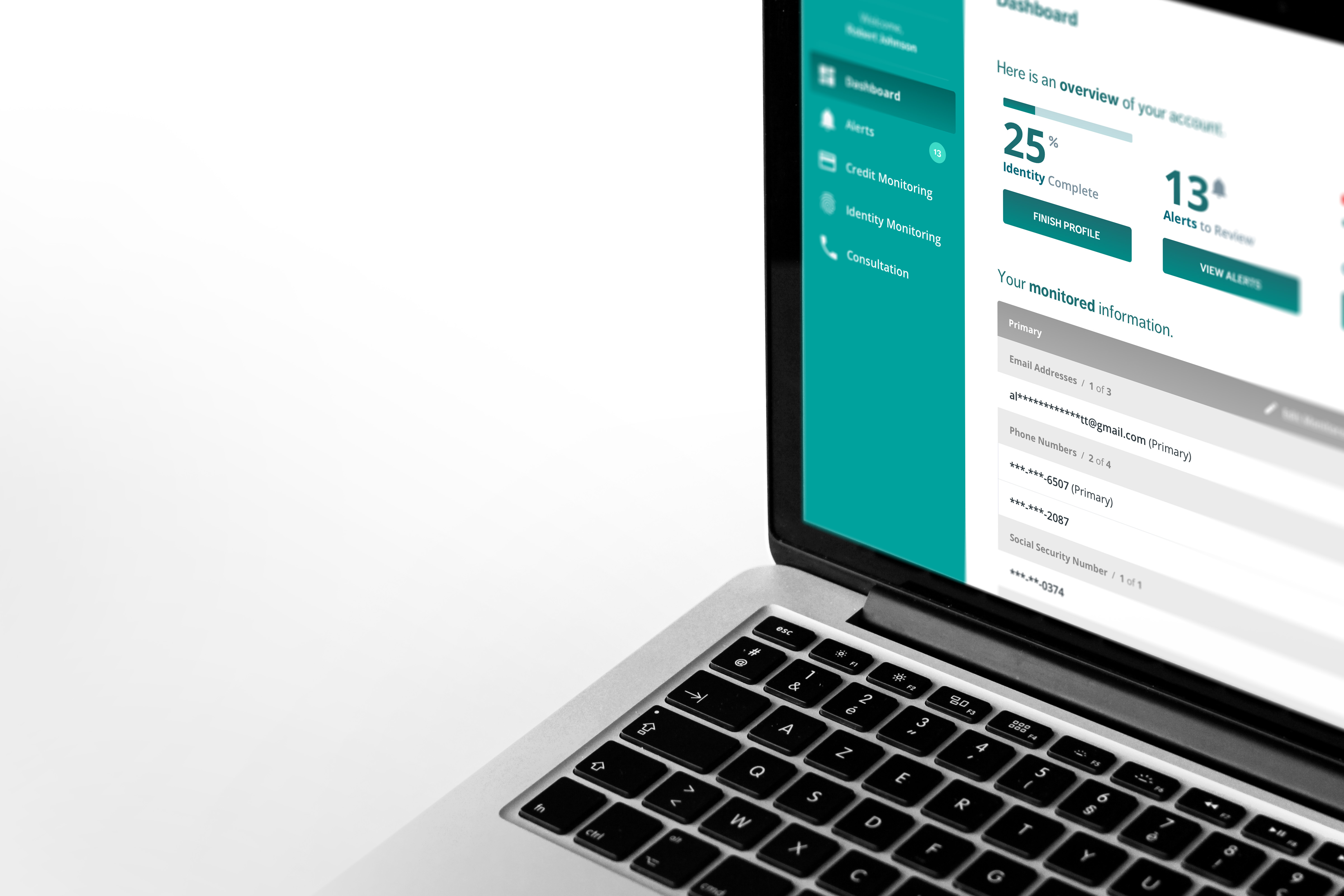
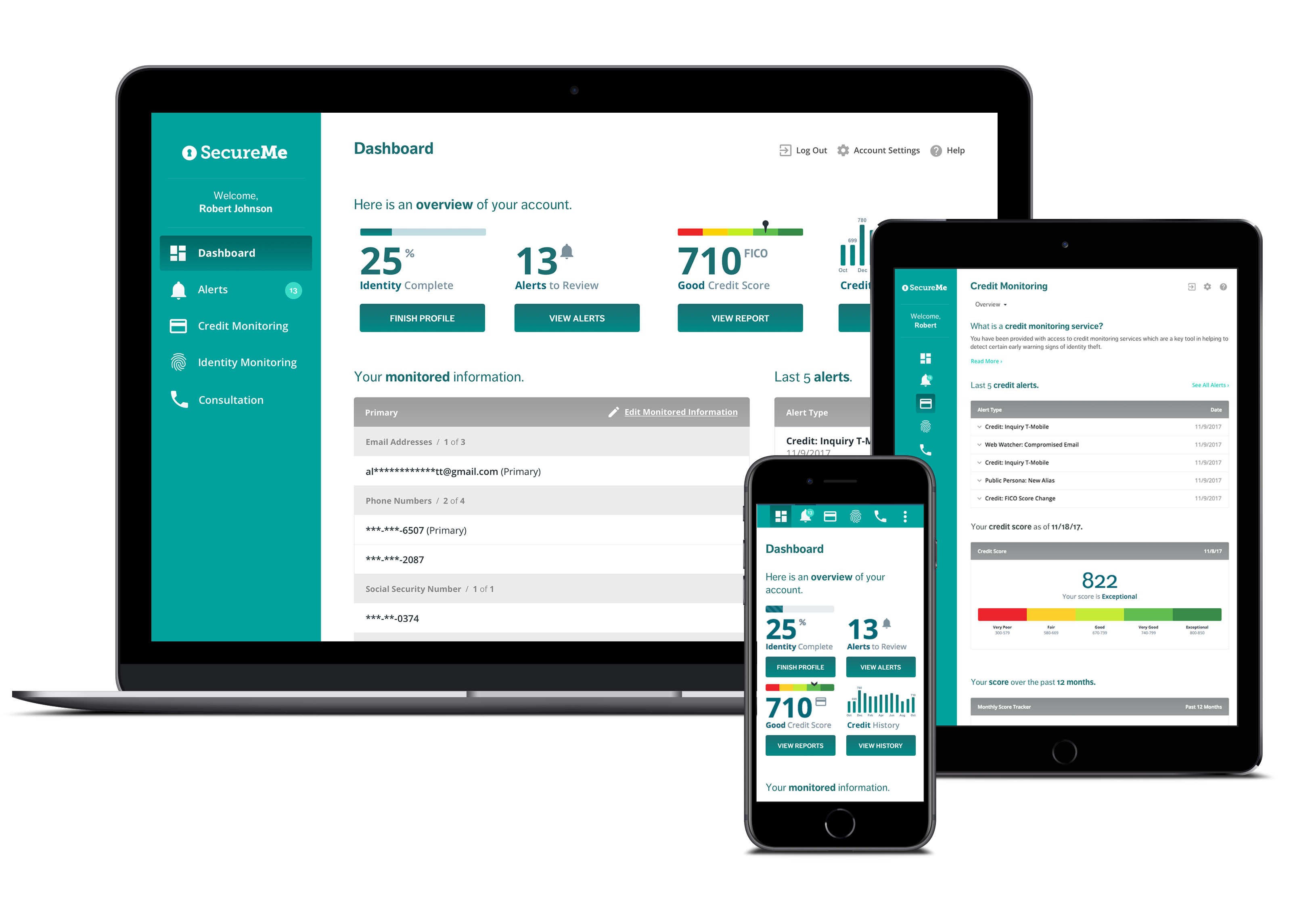
The app's user interface is fully responsive, meaning the components respond to the screen size and resolution of any device. This enables a consistent experience across mobile, tablet, and desktop users by providing access to all of the Software as a Service (SaaS) features regardless of device.
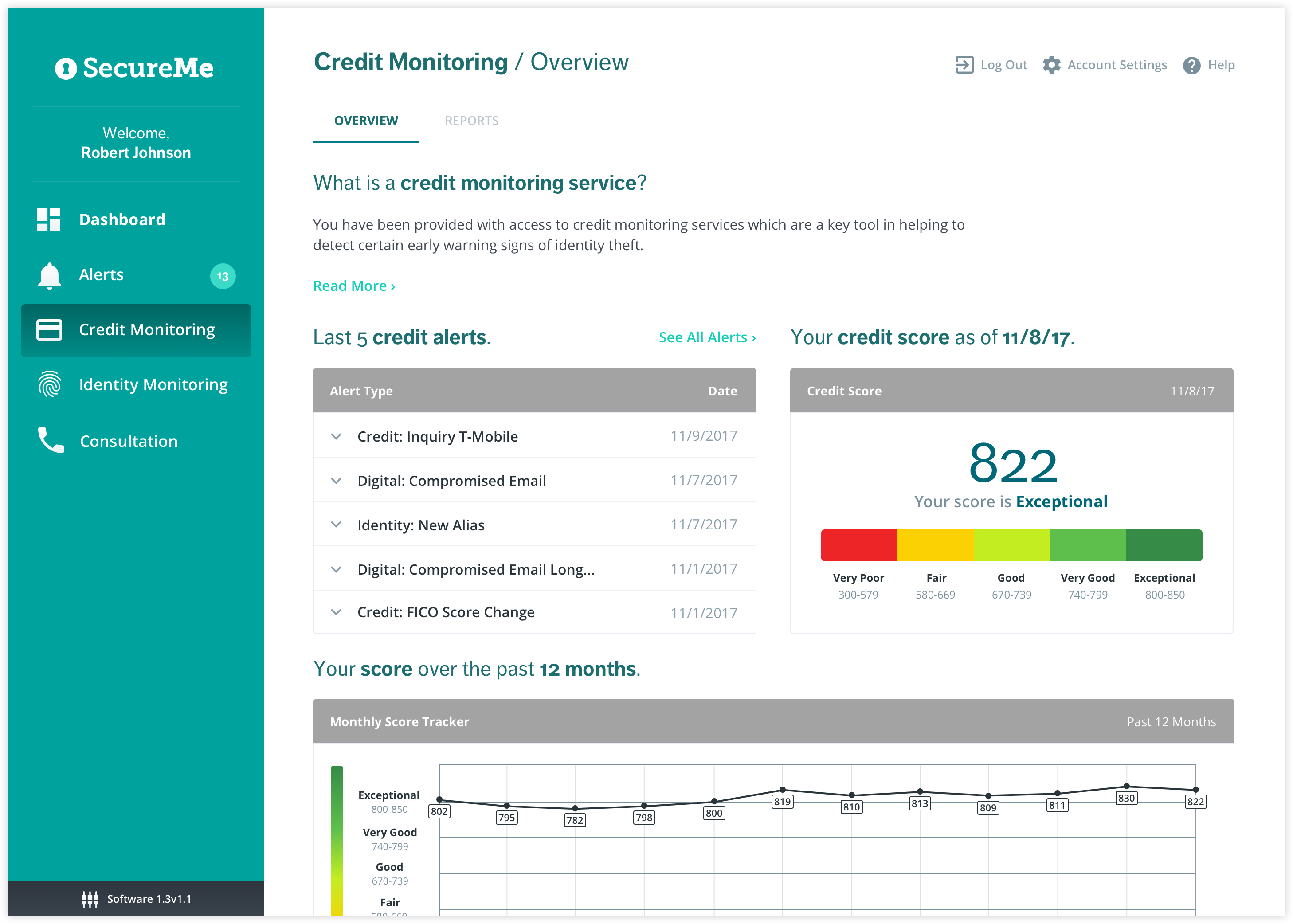
Whitelabeling
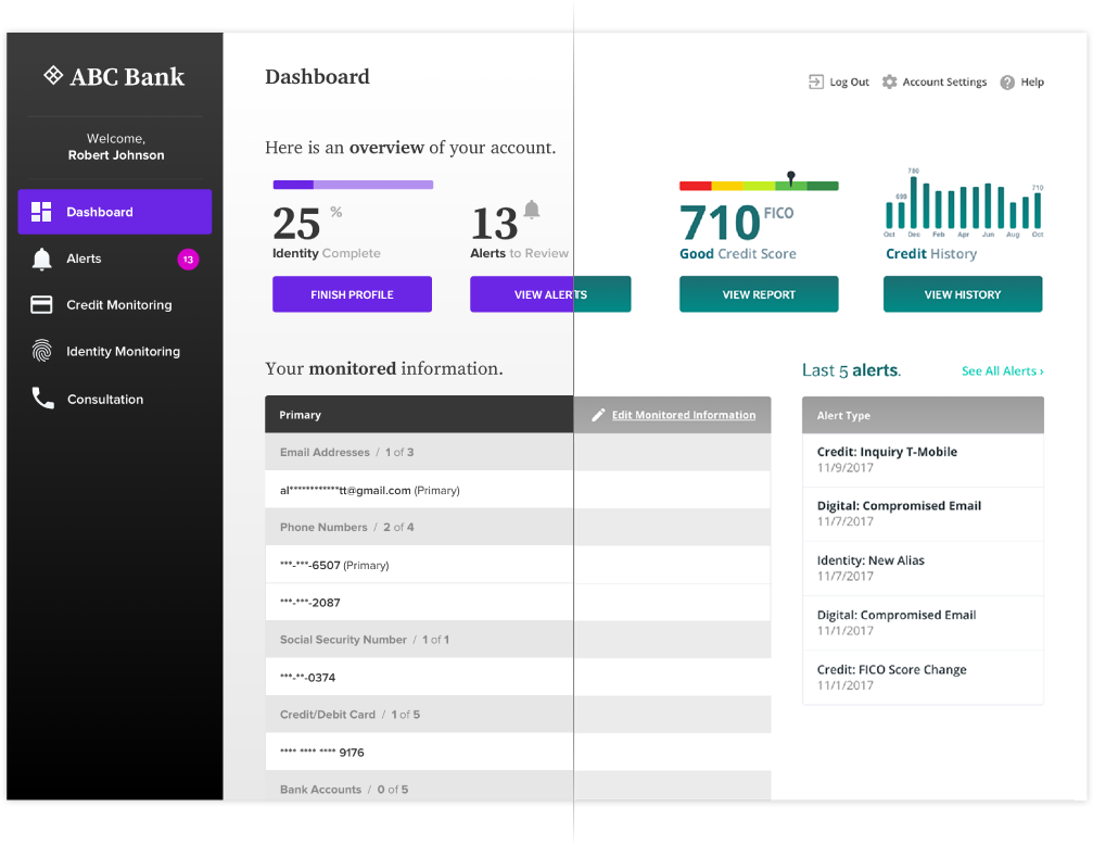
Our UI design needed a flexible structure to accommodate for white labeling by third parties. The variability of colors, typography, and components were controlled by well defined plug in code that will easily adjust as needed.
The goal of every well-designed application or product is a happy, productive user. Listening to their needs and delivering a solution that reflects their input will leave users feeling empowered.
What are you building? Get a FREE 30-minute consultation with our founders.
Complete the form below and we’ll call you ASAP. To tell us more and instantly schedule a meeting, complete our project form.

